I started out by researching the different emotions that we feel/experience, such as anger, disgust, fear, happiness, surprise, joy, passion, sadness, guilt, loneliness, confidence, love, anxiety and stress. I looked at positive and negative emotions and the characteristic's of these feelings. I considered the science behind the emotions that we feel, for example why we feel and react to certain situations in life eg. what chemical reactions happen in the brain, and I looked at descriptive words for each emotion in order to generate a deeper understanding of each feeling. Below is a list of websites that I used for research.
www.listofhumanemotions.com
www.buddamind.info
www.face-and-emotion.com
www.smashingmagazine.com
www.self-improvement-mentor.com/listofhumanemotions
www.buzzle.com/articles/list-of-human-emotionshtml
www.google.co.uk
www.wikipedia.com
As the list of emotions that we can experience is so vast, I made the decision to narrow it down to what in my opinion are the most common emotions experienced on a day to day basis, these were love, anger, sadness and happiness I will create four paintings, one for each of these emotions.
When researching these emotions I found that love is mainly associated with hearts, flowers (roses), pink and red. Anger - fire, flames, red, orange and black. Sadness - tears, grey, blue, rain, emptiness and shadows. Happiness - bright colours, flowers, sun and freedom.
Having now chosen the four emotions that I am going to portray in my paintings I looked into other artist in order to gain some inspiration.
Photographers Inez van Lamsweerde and Vinoodh Matadin did a series of black and white photographs called fake emotions. You see women exposing their bodies, but covering their face with their hands. In this way you don't see their facial expressions, but see another emotion painted on their hands, a fake emotion. they are naked but yet you cant see anything. kinda contradictive huh? Photographs can be seen below.
Reference - www.trendhunter.com

The women being naked in these photographs but covering their faces was very interesting to me, the fact that
they were naked made them exposed and vulnerable but by covering their faces with a 'fake' emotion and hiding their true emotion/ expressions they were empowered. I think this is very representative of how we are as a society, a lot of the time we mask our true feelings and put on a face that we want others to see, resulting in us hiding.
I plan to convey this message in my work, combining images of naked bodies with images and colours that are largely associated with certain emotions.
More artist research

Reference for Gary Hume image (above)
www.venicebiennale.britishcouncil.org
The forms and colours in this painting by Gary Hume are dramatically simplified, with people being reduced to just two or three colours.
Like Gary Hume I intend to use very simplified/stylized images, this will add to my message of hiding as I wont be portraying a real/life like image.
Colours and their meanings-
I looked at the colour wheel and the psychology of colour. paying particular attention to complimentary colours, negative and positive colours and the meaning that each colour has, for example yellow and orange are happy colours. The websites I used for research can be seen below.
http://www.blurtit.com/q637206.html
http://www.styleathome.com/decorating-and-design/colour/colour-your-world-happy/a/617/
http://www.precisionintermedia.com/color.html

www.peacefulmind.com
More artist research and exploring with ink-
Marleene Dumas-


Marlene Dumas has a very simplistic and casual style, her brush strokes are basic and obvious. She includes little detail and has a dark sinister approach to her work, using mostly black and dark colours.
Ilya Kareem-


Ilya Kareem also uses very simple techniques, he masks off areas with masking fluid, then drops ink onto a wet surface. When he removes the masking fluid he is left with clean crisp lines within the ink, creating beautiful shapes and silhouettes forming a simple line drawing effect. I have experimented with this technique, allowing the ink to spread and form shapes and patterns. This can be seen above (behind the Ilya Kareem images)
Stina Persson-


Stina Persson uses bright vivid colours, she masks off areas and allows ink to run feely, often creating very drippy effects. Her work has a loose and natural quality and is visually stunning. There appears to be an equal balance of order and chaos as the areas needed to be are perfectly formed with crisp neat lines, this control is a big contrast to the rest of the image which is messy and very uncontrolled, but seems to bring a complimentary amount of harmony to the image. I have experimented with using ink in this way, as can be seen above ( behind the Stina Persson images).
Taking inspiration from all my artist research I intend to work in a similar way, using a very simple approach. I will use masking fluid to draw the images this will add a certain amount of 'control' to my paintings, as we 'control' how our emotions are seen by others. I will then apply different coloured inks onto different sections of wet areas of the painting allowing the inks to mix and spread, resulting in a lack of control, as we truly have over our emotions.
Experimental drawings
Love-

Sadness-
Anger-

Happiness-

Final drawings-

Using flowers to represent happiness, tears to represent sadness, hearts to represent love and fire to represent anger. I will use bright happy colours for the happiness painting such as yellow and orange with a complimentary purple, sad colours such as grey, blue and brown on the sadness painting, colours associated with love such as red, pink and purple on the love painting and red,yellow and orange on the anger painting to represent anger.
Having chosen my final designs I projected the images using acetate and an overhead projector in order to scale them up to create large A1 paintings. I felt that the paintings needed to be large as as emotions are a large part of life. I then added the liquid latex, as seen below.

Below I have experimented with combining ink on water and masking fluid, in order to see the effect that it gave. I found that it created clean, neat, controlled lines against the loose, free and messy ink. This combination is very complimentary.

Below I have experimented with dropping ink onto a wet surface.

I then explored with colours using appropriate colours from my colour research-
Happiness-

Love-

Sadness-

Anger-

I then added the inks to the paintings-

This experimental painting that I did for the happiness emotion is too blue and needs more yellow as yellow is a happy colour.
Development-

Sadness-

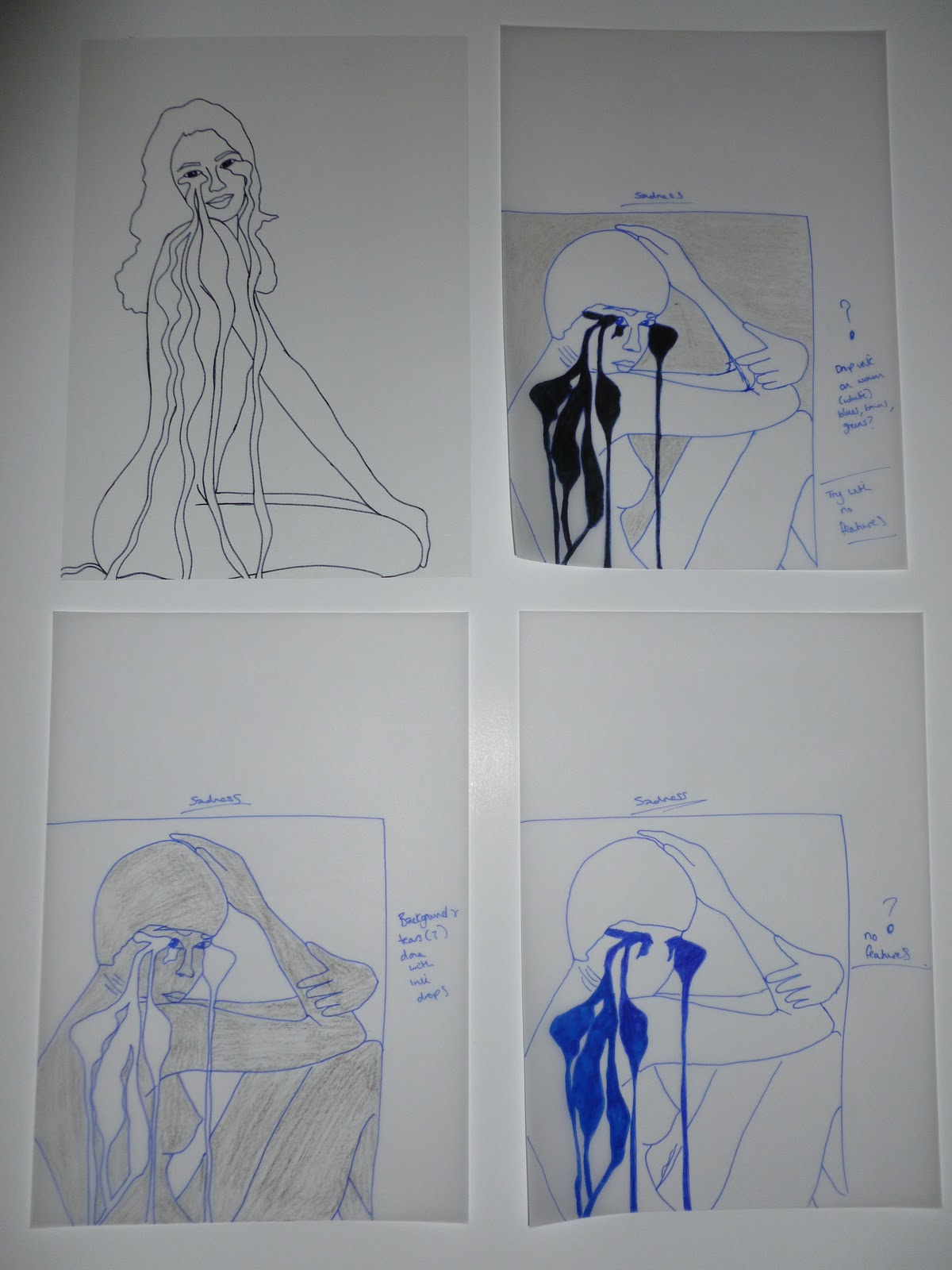
Blacking out the eyes in order to 'hide' the face, features and true facial expression.
Sadness-

I feel that the background in this painting portraying the sadness emotion isn't dark enough and needs to be a much darker brown, giving a more gloomy/sad effect. While working on this sadness painting I didn't work fast enough for the media that I was working with, which resulted in the ink drying before I was finished and forming darker patches of colour within the image that ideally I would not like to be there.
Anger-


The yellow on the body of this painting is too pale and needs to be darker in order to give a bolder effect.
Once I had finished the final versions of each emotion painting and they were dry I peeled off the masking fluid to reveal crisp white lines within the paintings. Final paintings can be seen below.
Happiness-

Sadness-

Love-

Anger-

Context-

To be hung for decoration purposes in the home.
When mounting the paintings onto mount board I found that the result wasn't very successful, this was because the paper had become warped from the use of water and ink on it making the paper lose its smoothness. This meant that the paintings couldn't be completely smoothed down onto the mount board, I think this resulted in the paintings looking unprofessional and untidy, this particularly applies to the Anger painting.
I plan to develop this module further using textiles.
No comments:
Post a Comment